Vrbo photos experience
Unlocking partners success: empowering them to seamlessly upload, assign, and reorder photos with an adaptive photos experience, delighting travelers with clarity and quality.

Vrbo is one of Expedia’s subsidiaries, a platform that connects property owners who are renting out their properties with travelers around the world. COVID led to a shift in how travelers travel–from booking hotels to booking vacation rentals, from short term visits to longer period stays. In order maintain our competitive edge in the market, we need to ensure that we are delivering intuitive and delightful experiences.
I’m on the partner team, tasked with the responsibility to improve the photos experience for vacation rental (VR) partners, a step in onboarding with the highest drop-off rate, at an astonishing 25%. It is a step that’s riddled with user pain points, unmet needs, and inconsistencies across the onboarding and post-onboarding (property editor) experiences.
Specifically, I designed a modular web app experience that allows partners to 1. assign photos into spaces, 2. easily reorder photos, and 3. offers improved photos error handling, while all at the same time, adapts and serves elegantly the different use cases and user goals in onboarding and property editor.
Duration
10 months
Role
UX Designer
Responsibilities
Interaction Design, Research
Team
Blake Singer (PM)
Chris Alexander; Jonathan Elbom (UX Engineers)
Dan He (UX Researcher)
Solution
BOOST TRAVELER CONFIDENCE AND TRUST BY ALLOWING PARTNERS TO ASSIGN PHOTOS TO SPACES FOR PRECISE ROOM DETAILS

Empowering partners to assign photos to spaces boosts travelers' confidence in booking with accurately mapped photos and amenities.
What are the amenities and bed types that are actually in each room? This is the question that travelers often times have when booking for a stay. Right now, photos of the entire property are lumped together in no specific category, leading to misalignment between traveler expectation vs. reality and traveler disappointment. Partners, on the other hand, seek to provide travelers with a room-by-room virtual tour that replicates the experience of personally welcoming and guiding them through their property. Letting partners to assign photos into spaces address both parties' needs.
EMPOWER PARTNERS TO REORDER PHOTOS TO CONVEY THE NARRATIVE OF THEIR PROPERTY

Partners want the autonomy to reorder photos in a way that best showcase their property’s unique character.
Partners take great pride in their properties and recognize photos' crucial role in influencing travelers' decisions. Partners want the freedom to arrange their photos according to their preferences to connect with travelers. The current experience lacks this feature due to design system constraints, so I designed the reordering functionality from scratch, from visuals to micro-interactions, to empower partners.
DECREASE DROP-OFF RATE AND PARTNER FRUSTRATION WITH IMPROVED ERROR HANDLING

Partners can swiftly resolve photo errors through guided coaching that precisely identifies issues and outlines necessary actions. The experience adapts accordingly, too, based on the different goals in the user journey.
The current photo error handling experience lacks the ability to display multiple error types simultaneously, leading to partner confusion and uncertainty. The overly technical error messages further complicate the resolution process. Additionally, the same error handling approach is used for both onboarding and property editor, disregarding their distinct goals. The enhanced experience addresses those issues.
A MODULAR EXPERIENCE THAT’S ADAPTIVE FOR DIFFERENT PARTS OF USER JOURNEY
Onboarding
Property editor


An experience that adapts based on user goals and needs, while delivering a consistent look and feel across the entire platform.
The current onboarding and property editor experiences differ significantly in terms of user experience and do not align with the distinct goals of each phase. This leads to confusion, as our partners encounter inconsistent and disjointed experiences. In addition, this doubles the development effort, as our developers have to create and maintain separate codebases.
Deep dive into the space
My task is to improve the photo experience, particularly by addressing pain points, unmet needs, and inconsistencies across various touch points on our partner platform. The goal of my design is to boost partner onboarding conversion rates, traveler booking rates, and overall partner and traveler satisfaction, ultimately making a positive impact on our bottom line.
In order to familiarize myself with the problem space, I looked at user archetypes, analyzed the current flows, interviewed internal help agents, and synthesized past relevant research.
PHOTOS’ TOUCH POINTS
Photos lie in the broader ecosystem of onboarding and property editor.
Current experience–Onboarding


Current experience–Property editor

USER ARCHETYPES
In order to design an experience that delights our partners, I need to first understand them better and in-depth. User archetypes will have design implications and serve as guiding design principles when I design and iterate on the adaptive experience.
Vacation rental (VR) partners are small property owners who have varying levels of experience, expertise, and tech savviness.
The design needs to support partners who have vastly different experience and proficiency levels with listing and maintaining their properties.
VR partners are renting out their own personal properties that they have a strong emotional tie with.
This emotional connection is especially apparent when it comes to photos. They want to have a say in how their property is showcased to travelers.
Unlike hotels, which have identical layouts for different room types, VR partners should not have identical photos for each property.
All photos that VR partners upload should be unique, and this has implications when they assign photos into spaces.

Vacation rental (VR) partners
The average number of photos that partners upload are around 20 photos, but the upper bounds go into the thousands.
The design should be optimized for assigning around 20 photos, while also being scalable and efficient for partners assigning significantly more.
MAIN DIFFERENCES BETWEEN ONBOARDING AND PROPERTY EDITOR
To design an adaptive and delightful experience for both onboarding and property editor, it is crucial to comprehend how goals and use cases between these two distinct user journeys differ.
 |  |  |
|---|---|---|
 |
USABILITY ISSUES AND UNMET OPPORTUNITIES
To understand and prioritize the problems to solve, I analyzed the current state, interviewed Expedia agents who assist partners, and reviewed previous research done on photos. By triangulating all the gathered information, we can identify the problems that, once solved, would have the greatest positive impact on our partners.
CURRENT FLOWS AND USABILITY ISSUES
Onboarding

1
Update the “add photo” CTA to a primary button so that it matches the information hierarchy
1
2
When uploading photos below the fold, there’s no feedback that those photos have been uploaded.
2

3
3
Only one error type can be shown at a time, causing partner confusion when multiple error types occur with uploaded photos.
4
Error messaging is overly technical
4
Property editor
.jpg)
5
5
Partners can’t drag and drop photos in property editor
6
6
Property editor and onboarding experiences are drastically different and inconsistent
UNMET OPPORTUNITIES BASED ON INTERVIEWS AND META-ANALYSIS ON PAST RESEARCH
I looked at 19 past research relevant to photos and interviewed 10 help agents who directly interact with partners. Then I affinity diagrammed all the notes to observe the overarching insights. From there, with the PM, we prioritized three main opportunity areas that would bring the biggest value to our partners and travelers.


3 MAIN FOCUS AREAS
Based on the findings from the discovery phase, in addition to making some small usability improvements, I will focus on 3 main opportunity areas that will bring the most value.
Both partners and travelers desire a better display of amenities within each space for an accurate preview of travelers' upcoming stays. But this can be achieved only if partners could assign photos into specific spaces.
1
Enable partners to assign photos into spaces
Partners take great pride in their properties. They seek the freedom to curate and arrange their own photos, empowering them to effectively convey their property's unique appeal to prospective travelers.
2
Empower partners to reorder their photos
Improve error handling
The current photo error handling lacks the ability to display multiple error types simultaneously, causing confusion, and the overly technical error messages further complicate the resolution process.
3
Adaptive experience
It is essential for all of these aspects to be adaptive to the different goals of onboarding and maintenance, while maintaining a consistent look and feel in the UX and UI.
Ideation
FIRST FOCUS AREA: ENABLE PARTNERS TO ASSIGN PHOTOS INTO SPACES
By triangulating research on partners and travelers, we found a mutual need: to improve the display and relationship between spaces, amenities, and photos.
Travelers are often confused when navigating a property’s photo gallery. They struggle to determine which photos correspond to each room and their associated amenities. This pain point is even more pronounced when there are multiple spaces of the same kind, with no clear indication of which photo belongs to which space. For example, if a property has four bedrooms, the photo gallery presents all the photos of different bedrooms in a jumbled, unordered manner. This lack of clarity disrupts travelers’ trust when booking.

I want to set the right expectations for guests that are coming, so that they’re not disappointed! Through photos, I can give guests a virtual walkthrough of my property.
"
-Partner
I immediately go to photos when I look up listings. I need to know what I’m getting and be able to imagine a stay at the property.”
"
-Traveler
DIFFERENT INTERACTION MODELS FOR PHOTO ASSIGNMENT
Recognizing the immense value that accurate assignment of photos into different spaces would bring to both partners and travelers and realizing that assignment is a much less explored area, I undertook several design explorations.
Exploration 1: assign spaces to photos

Interaction model
Upload all the photos first, then assign a space to each photo individually.
Pro
-
It doesn’t force partners into a loop of assigning all the photos into a space before they could move on to the next space.
-
Emphasizes uploading photos, the #1 job, over photo assignment.
Con
-
Requires partners to assign photos one at a time, could be very tedious if they have a lot of photos–doesn’t scale well.
-
If partners skip around when assigning photos, it’s easy to overlook and omit photos during the assignment process.
Exploration 2: assign photos to spaces

Interaction model
Partners upload photos to each space individually.
Pro
-
Partners could bulk select photos and assign them to a space. Very efficient when there are a lot of photos for each space.
-
What would have been two separate steps (bulk uploading photos and then assigning photos) now becomes one step of uploading directly into spaces.
Con
-
Partners have to go through a loop, more inflexible (e.g., need to upload all the bathroom 1 photos, then all the bathroom 2 photos)
-
More tedious if partners have just a couple photos in many spaces vs. partners have many photos in a couple spaces
-
Emphasizes assignment over photo uploading, and assignment isn’t the #1 job for the photos page.
-
The UI will look very cluttered on mobile.
Exploration 3: assign spaces to photos AND assign photos to spaces

Interaction model
Partners upload all the photos first. They could either bulk assign photos or individually assign photos. Also, they could either assign photos to spaces or assign spaces to photos.
Pro
-
This design doesn’t force partners into a loop, flexible (e.g., need to upload all the bathroom 1 photos, then all the bathroom 2 photos).
-
Emphasizes uploading photos, the #1 job, over photo assignment.
-
Supports both mental models of photo assignment
-
Supports individual assignment or bulk assignment
-
Scale well when there are a lot of spaces and photos
Con
-
Unsure if partners would understand the UX. This requires user testing.
EXPLORATION 3 IS THE BEST
Based on various considerations, such as design principles, scalability, suitability to both mobile and laptop, and project goals, I decided to go with Exploration 3. Exploration 3 has 4 main characteristics.

1. Supports both mental models of assignments
Partners have the flexibility to assign photos to spaces or assign spaces to photos.
2. Supports both individually assigning photos and bulk assigning photos
Partners have the flexibility to assign photos individually or assign multiple photos to a space at once.
3. Emphasizes photo uploading over photo assignment
Exploration 2 streamlines partner assignment with fewer clicks but requires partners to upload photos to each space separately, thereby prioritizing assignment over photo uploads. This contradicts with our primary goal of encouraging partners to upload more photos.
4. Scales well with both mobile and laptop
Analytics shows that most small vacation rental partners have their property photos on their phones, requiring a mobile-friendly design.
BUILT OUT A FUNCTIONAL PROTOTYPE TO TEST OUT EXPLORATION 3
To test my designs, I collaborated with a UX engineer to build out the experience to conduct usability testing with 6 internal Expedia employees. This agile approach gathers feedback and identifies improvements without going through the lengthy research recruiting and testing process with external partners.
Insights
A design that tried to be all-encompassing might just backfired.
The original idea was to offer individual and bulk photo assignment options. However, due to the concept's novelty, users stumbled upon the individual assignment method and completely missed the 'select' button that allowed for more efficient bulk assignment.
1
Users are anxious that they might lose their work in this high effort step.
Users are hesitant to perform any actions that they think could result in the loss of their work or progress. They need constant assurance that their work is being saved in this high-effort step.
3
Users need more incentives to assign photos.
Often times, users want to go through onboarding as quickly as possible. Taking and uploading photos is already a high-effort. Assignment adds additional efforts to that step. We need a way to encourage partners to assign photos without blocking them from moving through the flow.
2
Users often times do multiple uploads, and the design needs to support that.
The "Assign your photos" dialog pops up with each photo upload. This is particularly frustrating when the dialog appears after users drag and drop a single photo, interrupting their intention to upload more.
4
Design iterations
Based on insights I uncovered from the usability testing, I iterated on the designs to ensure that the UI addresses partners’ needs and that the flow fits their mental model.
SCREEN ITERATIONS
Original

Redesign

By removing some user actions, I create a design that efficiently guides partners to the desired behaviors and removes friction.
By simplifying the design so that there are only two possible actions on the UI (i.e., select a photo or select a space), partners are naturally guided to perform the desired actions and partner confusion is then minimized.
In addition, by removing unnecessary controls, such as the “select” button, the design requires less clicks from the partners. Thus, reducing the effort required for this step.
Original

Redesign

Adding indicators when partners are assigning photos and having smarter playback like showing empty spaces will encourage partners to assign photos to spaces,
By showing partners empty spaces on the photos step, it visually reinforces the need for attention and encourages partners to assign photos to those spaces. Additionally, the incorporation of numbers alongside each empty space and in the dropdown menu add a gamification aspect to the assignment process, as partners could see in real-time when photos are getting assigned.
Original

Redesign

Adding a toast and the “done” button on a high-effort, high-interaction step gives partners confidence in their actions.
Initially, I hesitated to include a toast, concerned that it might introduce clutter to a high-interaction step. However, through testing, I discovered that participants were uncertain about the destination of their assigned photos. They were also reluctant to click on the "X" button, fearing that their progress would be lost. Thus, I added in the toast and the “done” button, all aiming to boost partners’ confidence throughout the process.
FLOW ITERATIONS
During the usability testing, I discovered that my design assumed incorrectly that partners would upload all their photos in one single upload. As a result, the "assign your photos" dialog would erroneously appear even when partners uploaded just one photo.
The photos design needs to achieve three main user goals:
1. Upload & view: upload and view their photos at a glance
2. Assign: assign photos to spaces
3. Review: review their actions
I designed the photos page originally as a single page to maintain consistency with the rest of onboarding pages. However, it became clear that I need to revisit the design's flows.
Exploration 1: use 1 screen fulfills the 3 goals

SCREEN 1.1
SCREEN 1.2
SCREEN 1.3
SCREEN 1.1
Interaction model
After partners upload some photos, the “Assign photos” floating button appears, which triggers the “Assign photos” dialog. Once photos have been assigned to spaces, the photo grid will be replaced with hub and spokes.
Pro
-
The one page design adheres to the rest of the onboarding pattern.
Con
-
The “Assign photos” floating button isn’t very prominent, and without additional context, it’s not clear the purpose of that button.
-
Once partners start assigning photos, the photo grid view is replaced with hub and spokes, and there is no longer an easy way to view all uploaded photos at a glance (goal #1 is not fulfilled).
-
The “Assign photos” floating button doesn’t work well on laptop
Exploration 2: use 3 screens to fulfill the 3 photos goals

SCREEN 1.1
SCREEN 1.1
SCREEN 2
SCREEN 3
Interaction model
After partners upload some photos, they would click “Next” to assign photos and click “Next” again to see an overview of their actions.
Pro
-
This design makes the 3 photos steps (upload, assignment, and overview) very modular, which makes it easy to reuse and reconfigure for different use cases.
-
Unlike exploration 1, the “assign photos” action is very prominent and hard to miss.
Con
-
This 3 page design will require modifications in the property editor experience.
-
Creating a separate page for the optional assignment step contradicts the onboarding pattern, where all other pages are required, and misrepresents the step's importance to partners.
-
Partners would have to navigate back to the previous page if they want to assign more photos, which adds friction.
-
This design makes the photos step seems very lengthy.
Exploration 3: use 2 screens to fulfill the 3 photos goals

SCREEN 1
SCREEN 1
SCREEN 2.1
SCREEN 2.2
Interaction model
After partners upload some photos, they could assign photos and see the playback of their photo assignment actions on the next page.
Pro
-
It makes the 3 photos goals very modular and could be easily reassembled for property editor.
-
It’s more obvious that assignment is optional, while at the same time the visual prominence of the assignment card encourages the action of assignment.
-
Onboarding and property editor experiences could be almost identical.
Con
-
The hub and spokes need to reflect in real-time the changes partners make when assigning photos, which might need more engineering efforts.
-
Hub and spokes would update in real-time in the background when partners are assigning photos, which could be disorienting.
An adaptive experience for photo assignment
To achieve a photo assignment experience for both onboarding and property editor (PE), the design must be scalable and adaptable to accommodate the unique differences between the two.
Three main distinctions between onboarding and property editor are:
1. Flow: Unlike PE, onboarding flow is linear, utilizing bottom navigation for progression. Thus, it’s essential to let partners see the assignment task without scrolling to the bottom of the page in PE.
2. Space creation: Unlike existing partners, new partners would create spaces as part of the new onboarding experience. PE needs to direct existing partners to create spaces before asking them to assign photos.
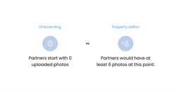
3. Initial photos: Partners start with 0 photos in onboarding, whereas partners who see the PE experience would at least have 6 photos.
The experience adapts for Property editor's use cases

Metrics
Increase traveler confidence and satisfaction
Travelers are now able to confidently book a stay on Vrbo, taking away any guesswork, with partner-assigned photos to spaces. This enhancement promises increased traveler satisfaction, addressing the 32% negative reviews related to amenity availability. Additionally, our efforts in building relational data could lead to smarter mapping on our site, such as automatically removing a corresponding photo when partners indicate an amenity is no longer available.
Projected conversion uplift of 1.49% in bookings, equivalent to a gross profit of $12.7 million
In February 2020, we conducted a test that linked room photos with room details. It resulted in a 1.49% CVR increase and a $12.7 million GP win. Delivering clear information to travelers translates into significant profits.
Significantly decrease dev efforts and time
Introducing an adaptive onboarding and property editor experience with reusable components significantly boosts developer efficiency. They now just need to maintain one codebase, reducing the time and effort by half.
Future visions
Use ML algorithms to assign photos into spaces
ML models can automate the photo assignment process by identifying bedroom, kitchen, and living room photos. Partners' role shifts to that of a checker, reviewing the model's suggestions and only intervening when needed, rather than manually assigning photos to spaces.
Integrate different datasets to improve partner coaching and empower travelers with a more comprehensive view of the partner’s property
Using image processing and recognition, we can identify any overlooked amenities and missing photos by comparing the amenity details provided by partners with their uploaded images, ensuring a complete and accurate property representation for travelers.
Support different forms of showcasing partners’ properties
Enable partners to upload short videos or reels of their properties. This allows travelers to get a firsthand view of the property and creates opportunities for partners to personally connect and communicate with travelers through the videos.